There’s a razor-thin line at restaurants between understaffing and overstaffing.
The dining experience suffers when there isn’t enough staff to service the customers. And when there’s too many staff for the amount of customers, it wastes money.
In both situations, staff morale declines. The team is either stressed from servicing too many tables, or they get discouraged when there aren’t enough tips to go around. Ultimately, poor employee morale has a spillover effect on the guest experience.
The reality is, forecasting sales and planning labor are among the most important and challenging aspects of running a restaurant. In the anatomy of a restaurant, these tasks are the spinal cord.
The healthiest restaurants get this right. For most stores, though, there’s little bandwidth to spend hours scrutinizing numbers in pursuit of the perfect labor-and-sales mix. So many restaurant managers wing it.
Applying guesswork to something so vital is a problem.
Looking Beyond The Numbers At Restaurants
Generally speaking, restaurants aim for hourly labor costs of 14-20% of their sales. Every restaurant has an optimal labor percentage, but most people don’t know what their target is. It’s nearly impossible to quantify without a report to analyze the labor and sales data in narrow time intervals.
Without quantitative feedback, the best restaurant managers can do is to stand in the restaurant to observe and track the operations in real-time. It’s not practical for the manager responsible for labor planning to be in unit all the time, nor is that approach accurate.
Over long time horizons, restaurants may come close to or hit their target labor percentage, but they are still likely missing key opportunities such as if they’re understaffed at one time of the day and overstaffed at other times. It creates dysfunction that may be missed if you’re looking only at the 10,000-foot view.
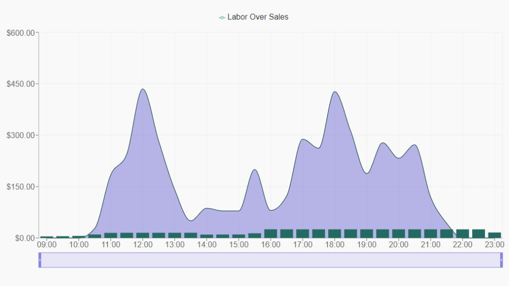
A screenshot of a labor vs. sales chart in Axial Commerce. This is set to 30-minute increments. The green bars represent hourly labor costs, and the blue area chart shows restaurant sales.
Different Ways To Analyze Restaurant Data
As restaurant industry veterans, we know these issues all too well. The constant balancing act between labor and sales always felt like more art than science, so we designed Axial Commerce software to help us make smarter decisions in a more timely manner using data.
Also, we know that everyone learns differently. Some people want to review the raw data, while others are curious about how they’re performing vs. a predetermined benchmark. Other people are visual learners who prefer graphs and charts. With that in mind, we developed a BAR method (benchmark, analysis, raw data) to help managers establish a goal, track their progress toward that goal visually, and gain access to the underlying data.
This approach helps managers gather detailed feedback that is easy to understand, measure progress, and execute a consistent labor plan. It’s all available in the Axial Commerce dashboard.
The goal is to give operators a way to make faster, more data-informed decisions. This is how the best restaurants are set up to win.
To start a free trial, to schedule a demo, or to learn more, register at https://app.axialcommerce.com/register or contact us by clicking here.